Key Performance Indicators Charts
One of the most useful tools that can be added to your SugarCRM instance is Dashlets. What is by default a blank Home page can be turned into a visual report of the most important business indicators at a glance.
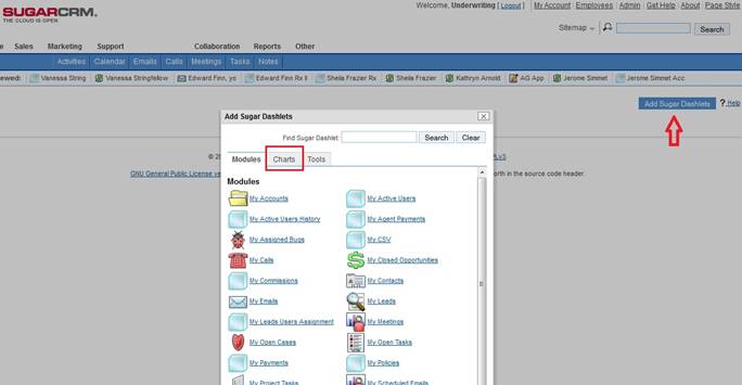
After pressing the ‘Add Sugar Dashlets’ button on the Home page, the user is prompted with a pop-up window. This allows him to select what he wants to see each time after the first login or whenever he presses the home button.
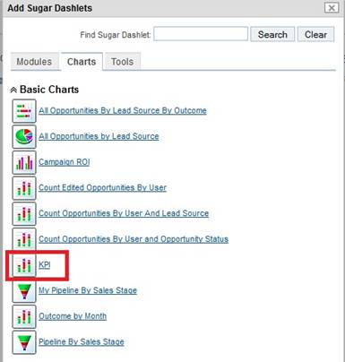
The Charts tab is where the statistical data can be found. In this example, the focus will be the Key Performance Indicators (KPI).
The user has to click on whichever chart he prefers, close the pop-up and refresh the Home page. Multiple clicks add multiple charts.
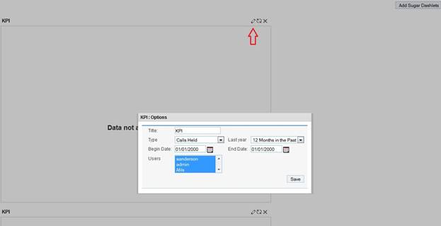
In order to actually see a chart generated, the user has to select the data that will be plotted, much like in an Excel worksheet. In the top right corner of the chart area there is a button called ‘Edit Sugar Dashlet’. It opens another pop-up, where the user can see the chart options.
The chart can be renamed, plotted against certain types of variables, throughout the last year or a predefined period of time, and over particular or all users of the SugarCRM instance.
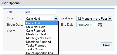
Taking a closer look at the type of variables in this case, data can be restricted to calls held, not held or planned, meetings held, not held or planned, tasks planned or closed and count of opportunities (how many opportunities has each user been assigned to).
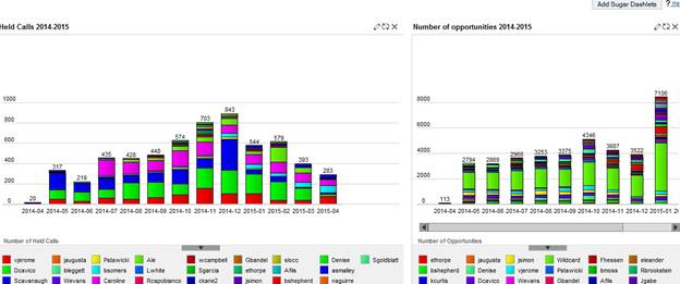
Once the options are configured and the chart loaded, the area will look like below (in this case, we plotted for calls held and count of opportunities for the last 12 months for all users on the instance). Depending on how many charts are generated, the space will be split accordingly and the user can move the charts up, down and to the sides.
The charts can be refreshed or deleted by using the buttons in the upper right corner of each graph.
By using this color coded visual representations, managers can draw quick conclusions on which user is more active, more productive and more committed to getting the deal closed. The time frame option allows comparisons over periods of time and helps to establish peak and off-peak activity intervals. Not only is it a good way of seeing what happened in the past, but it is also an overview of what is happening now and a starting point for what can be improved in the future.


